
Branding / Art direction
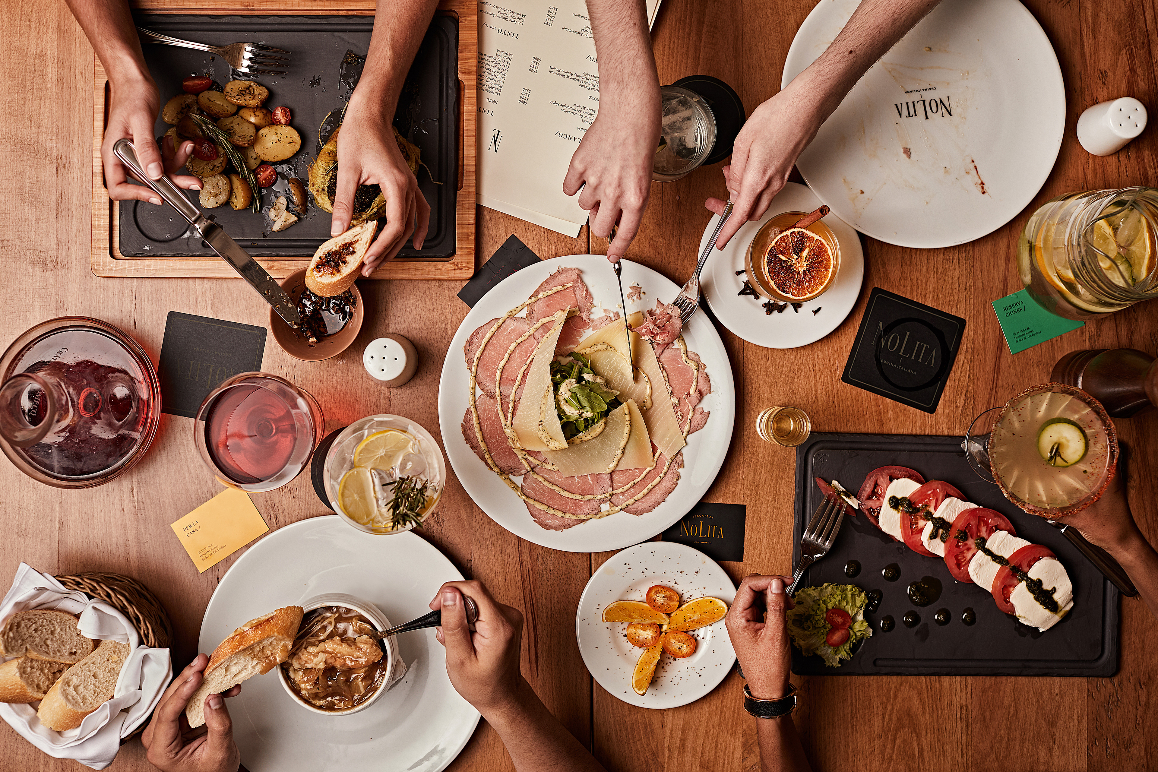
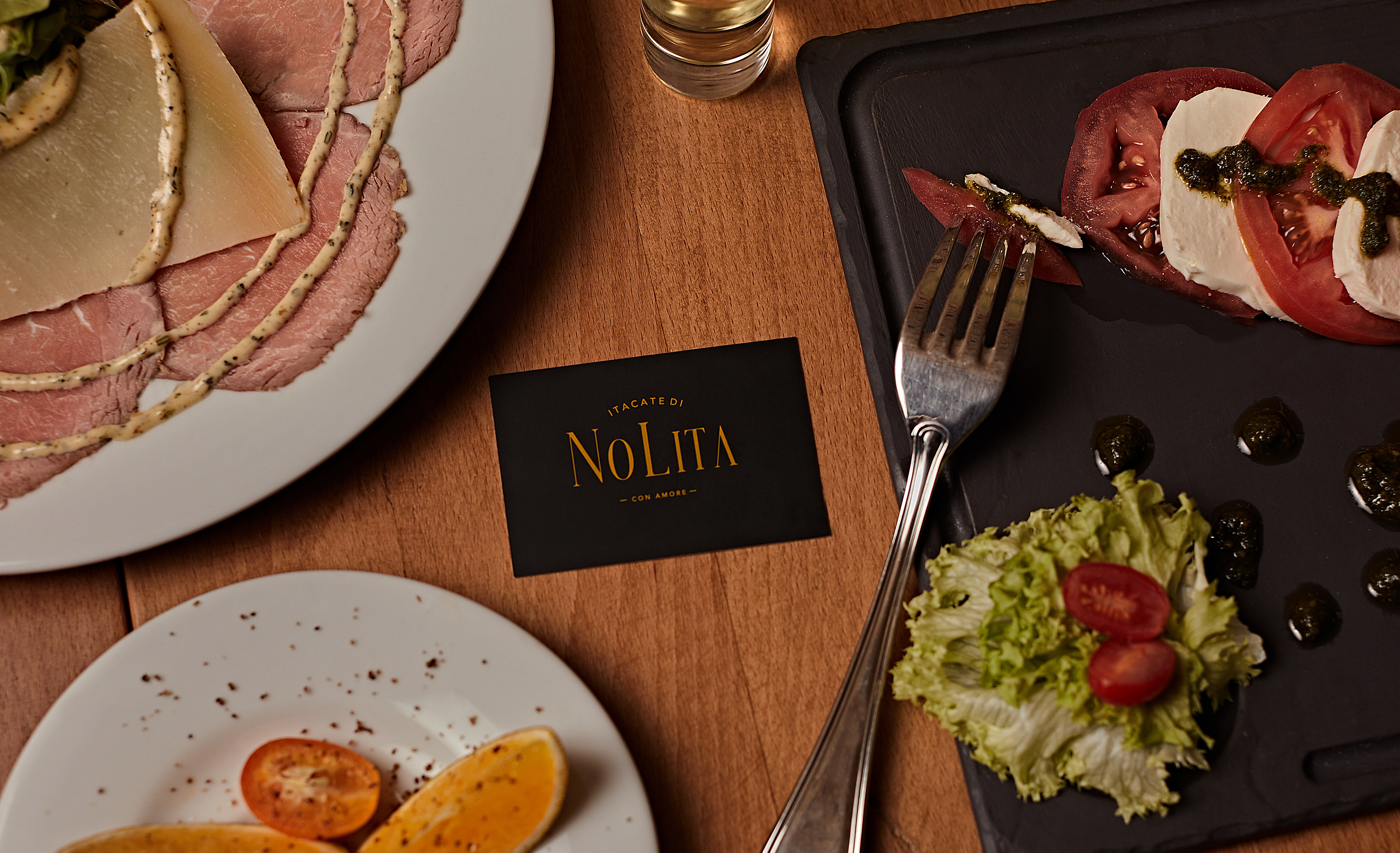
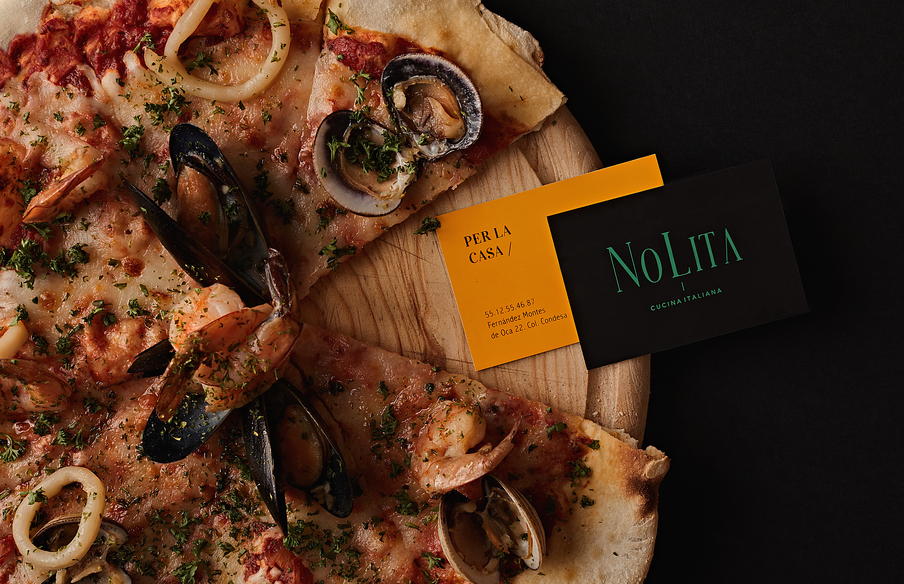
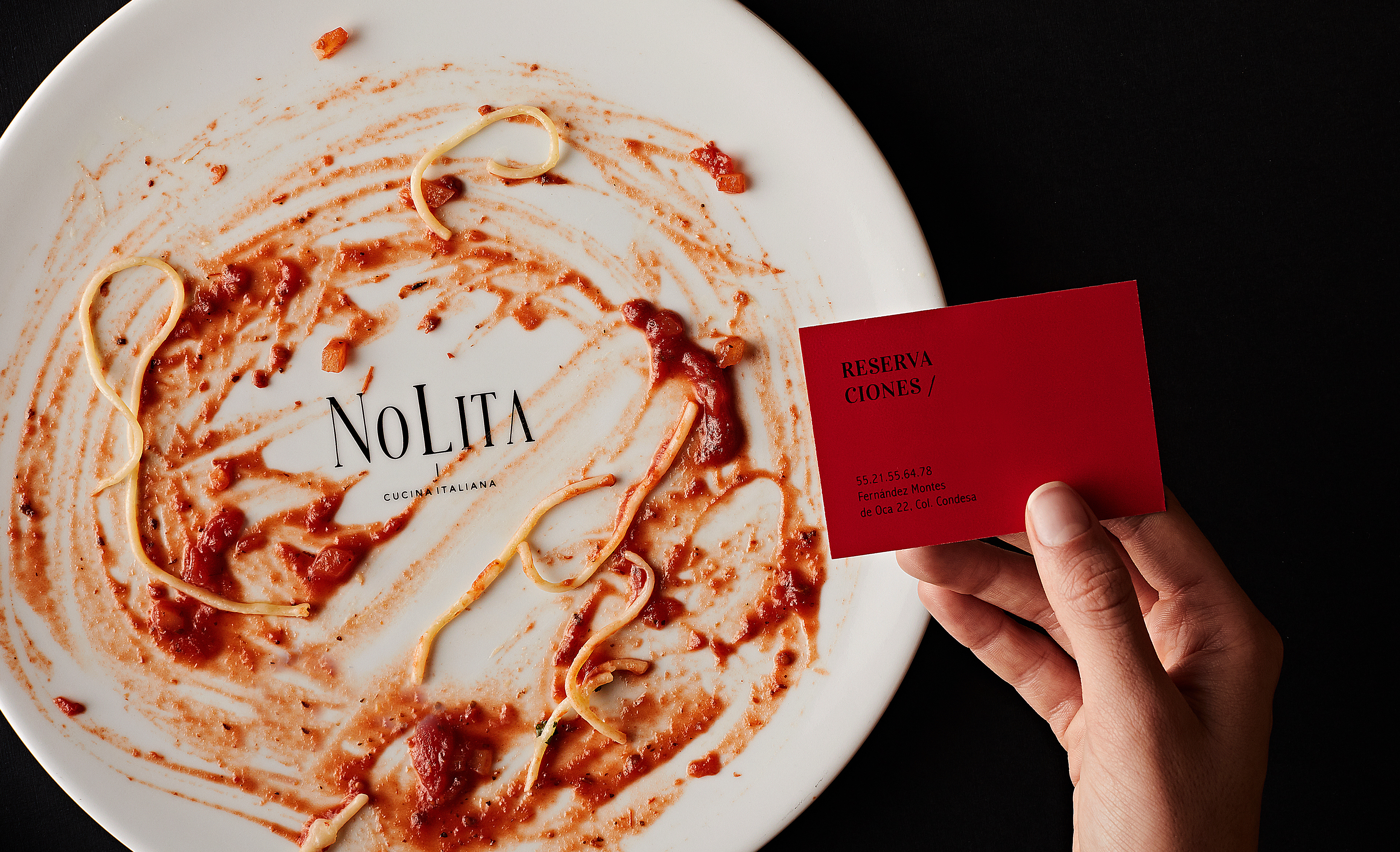
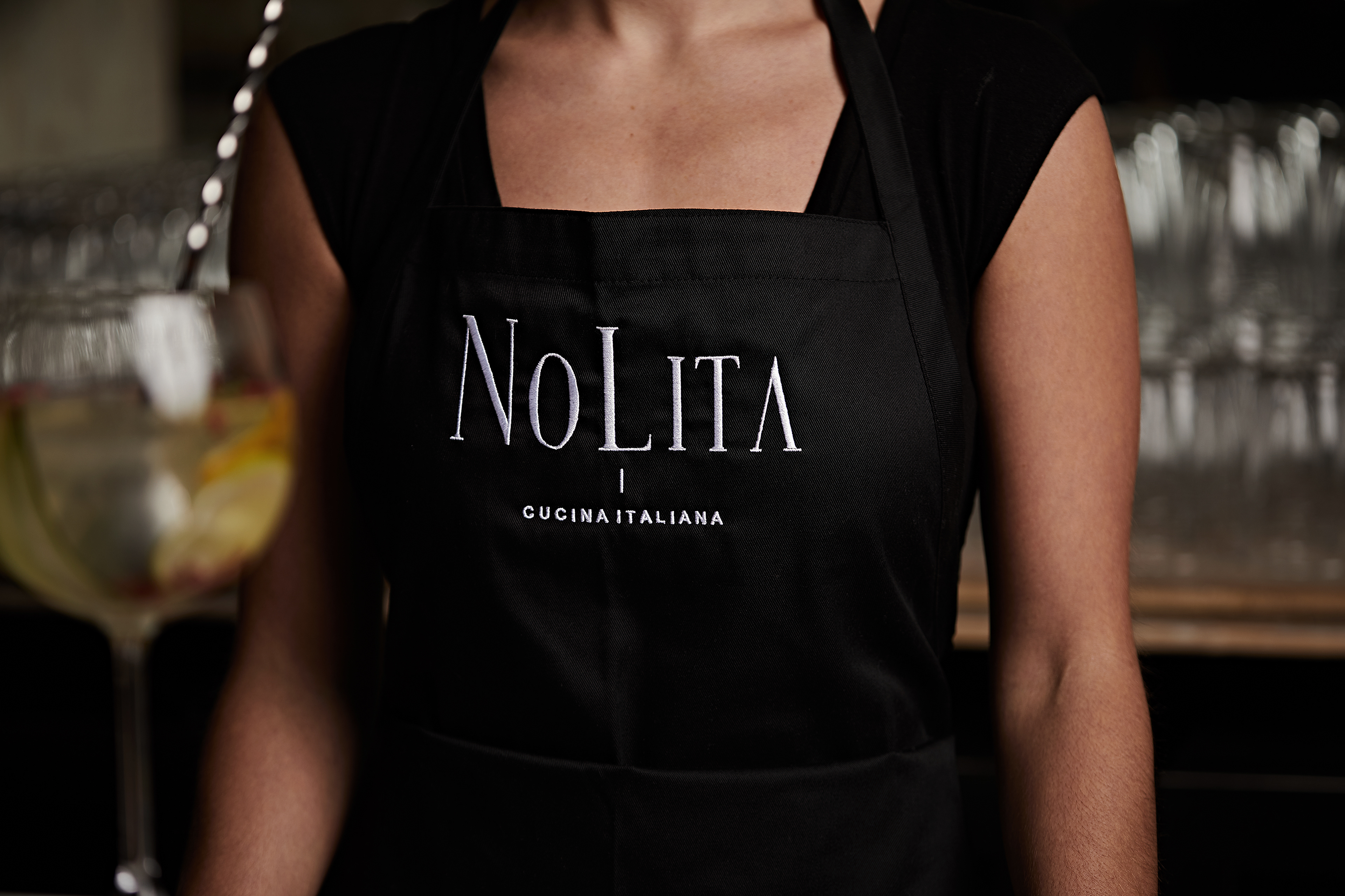
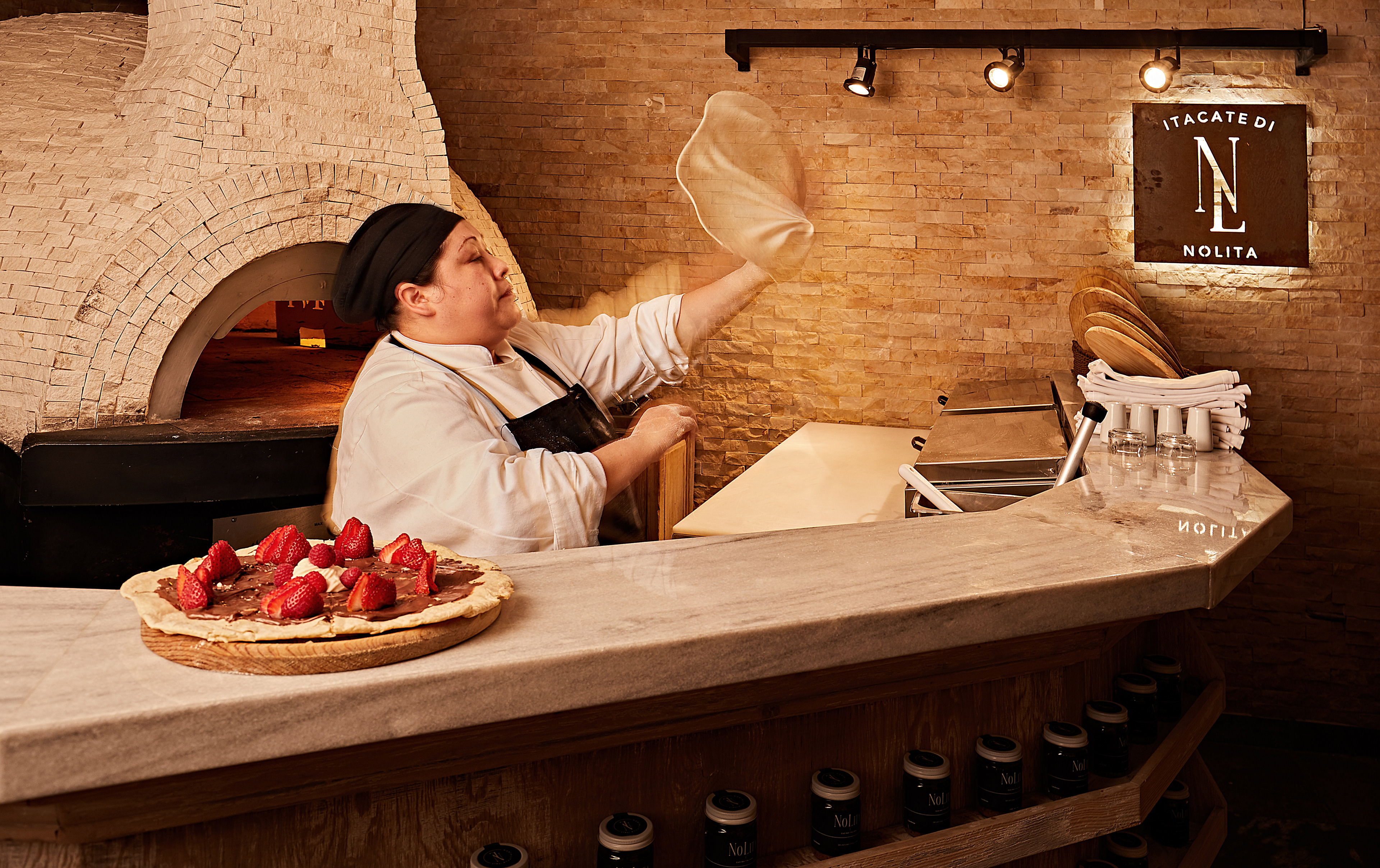
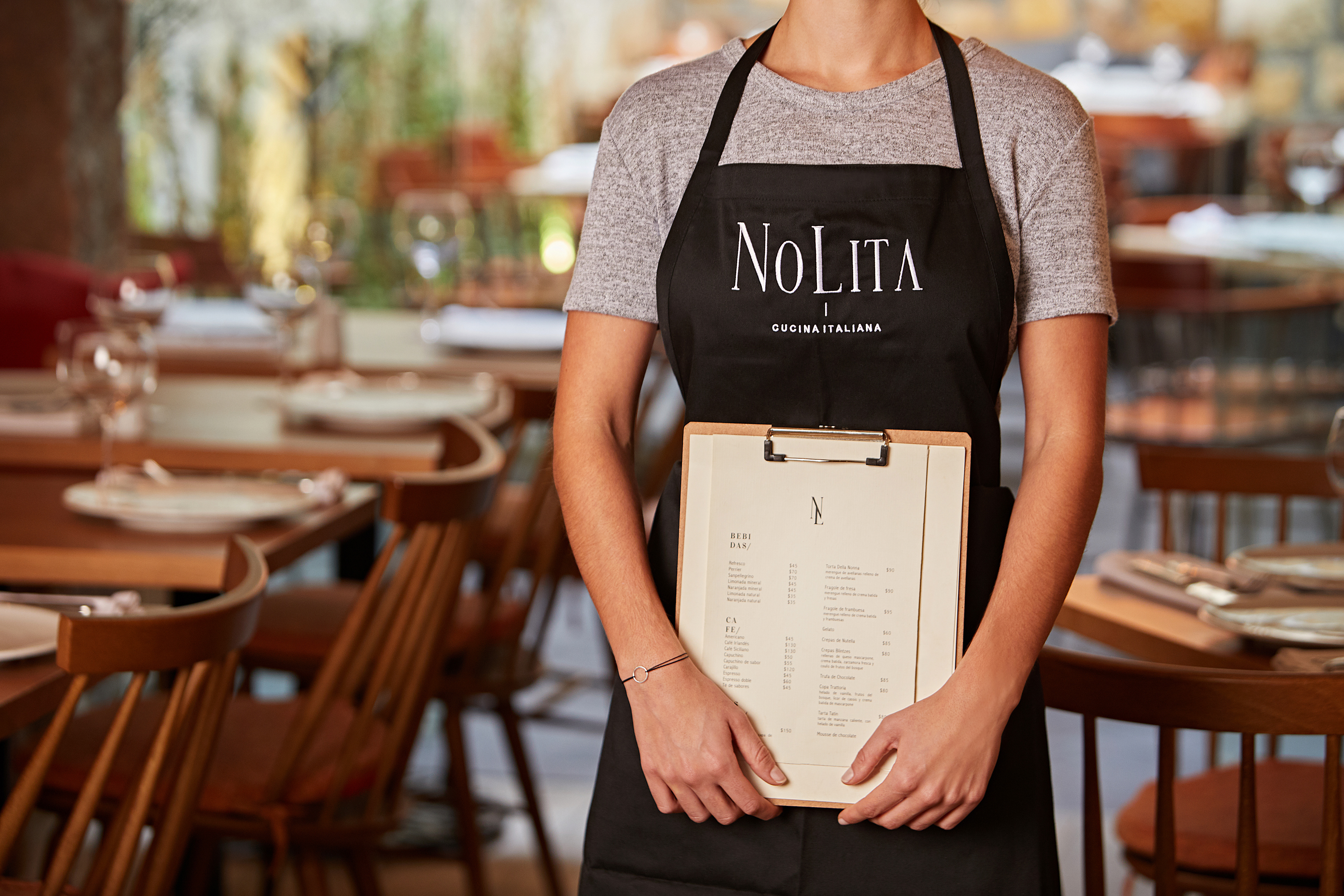
Nolita, an Italian restaurant inspired by the Tuscany villas, in the heart of Mexico City /
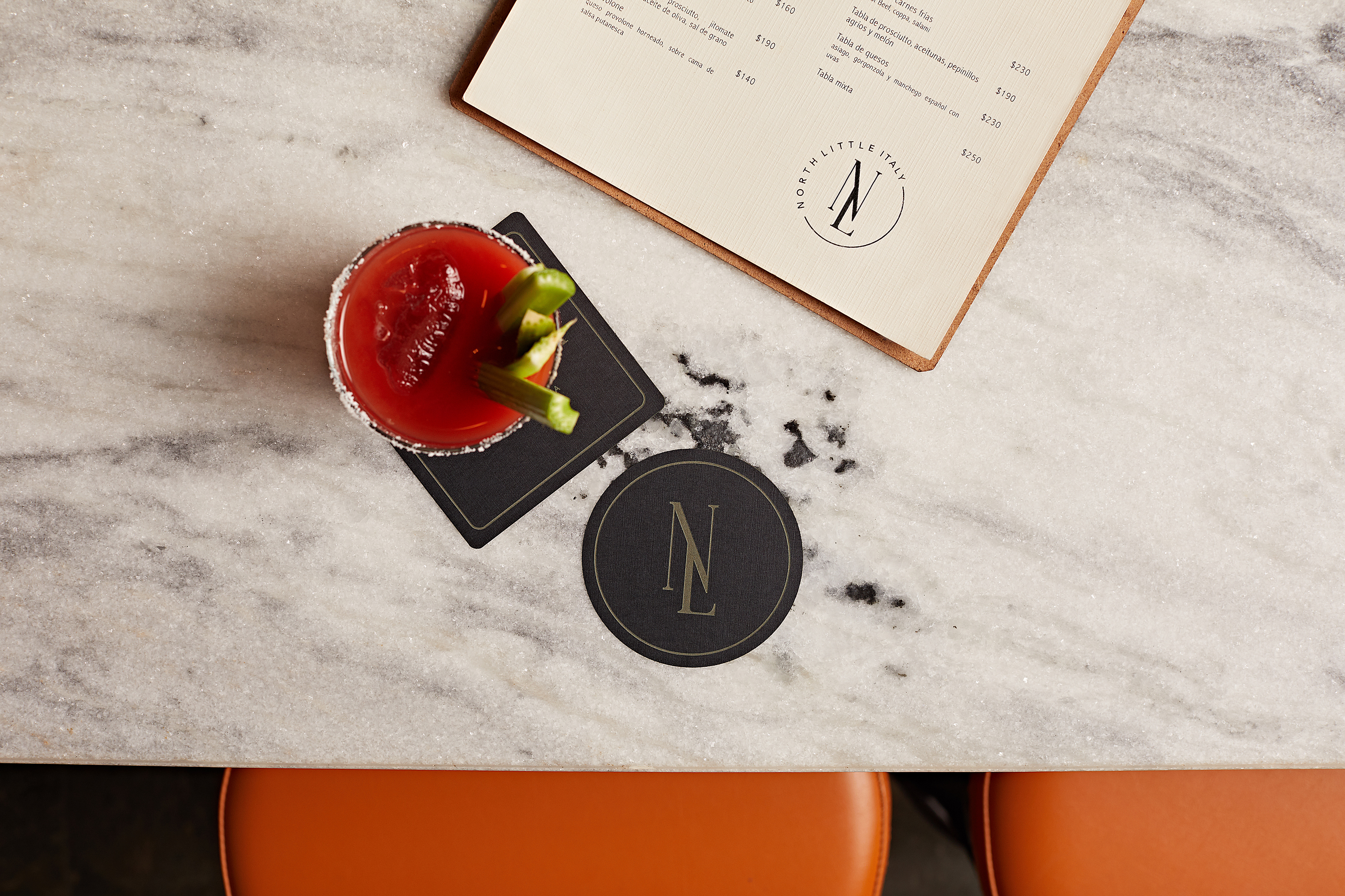
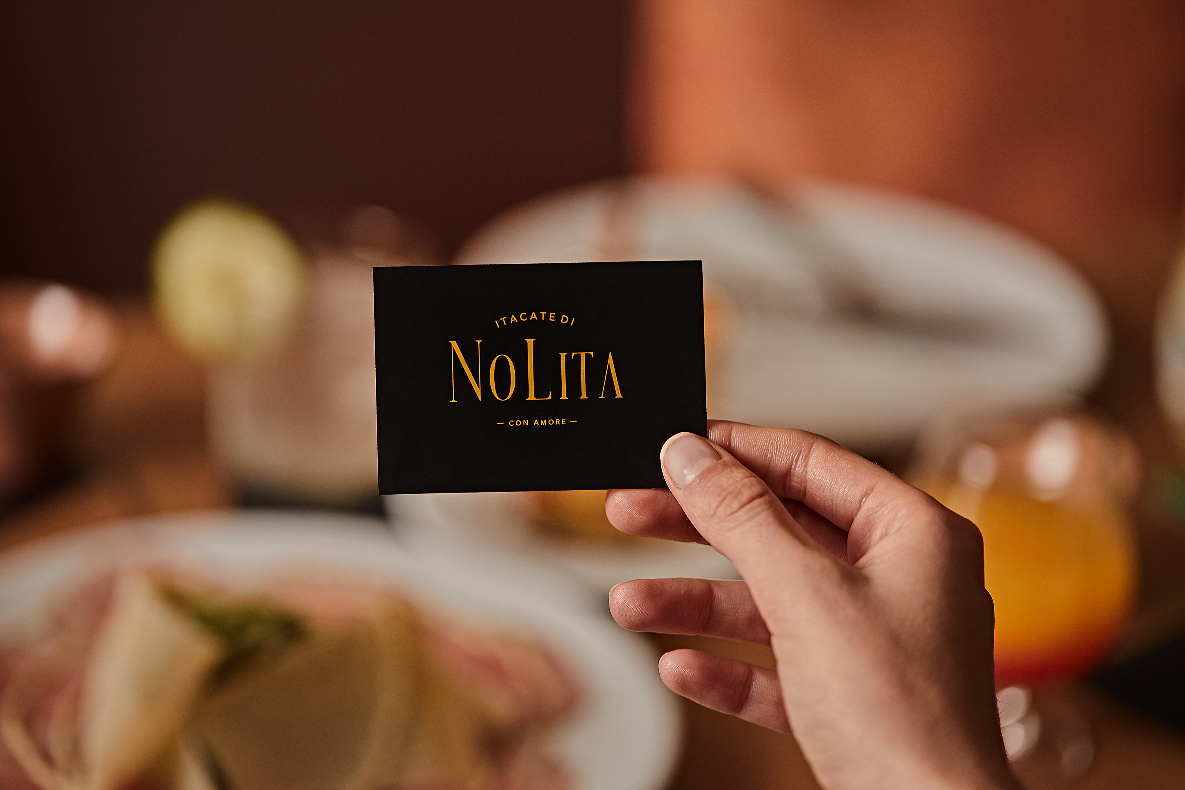
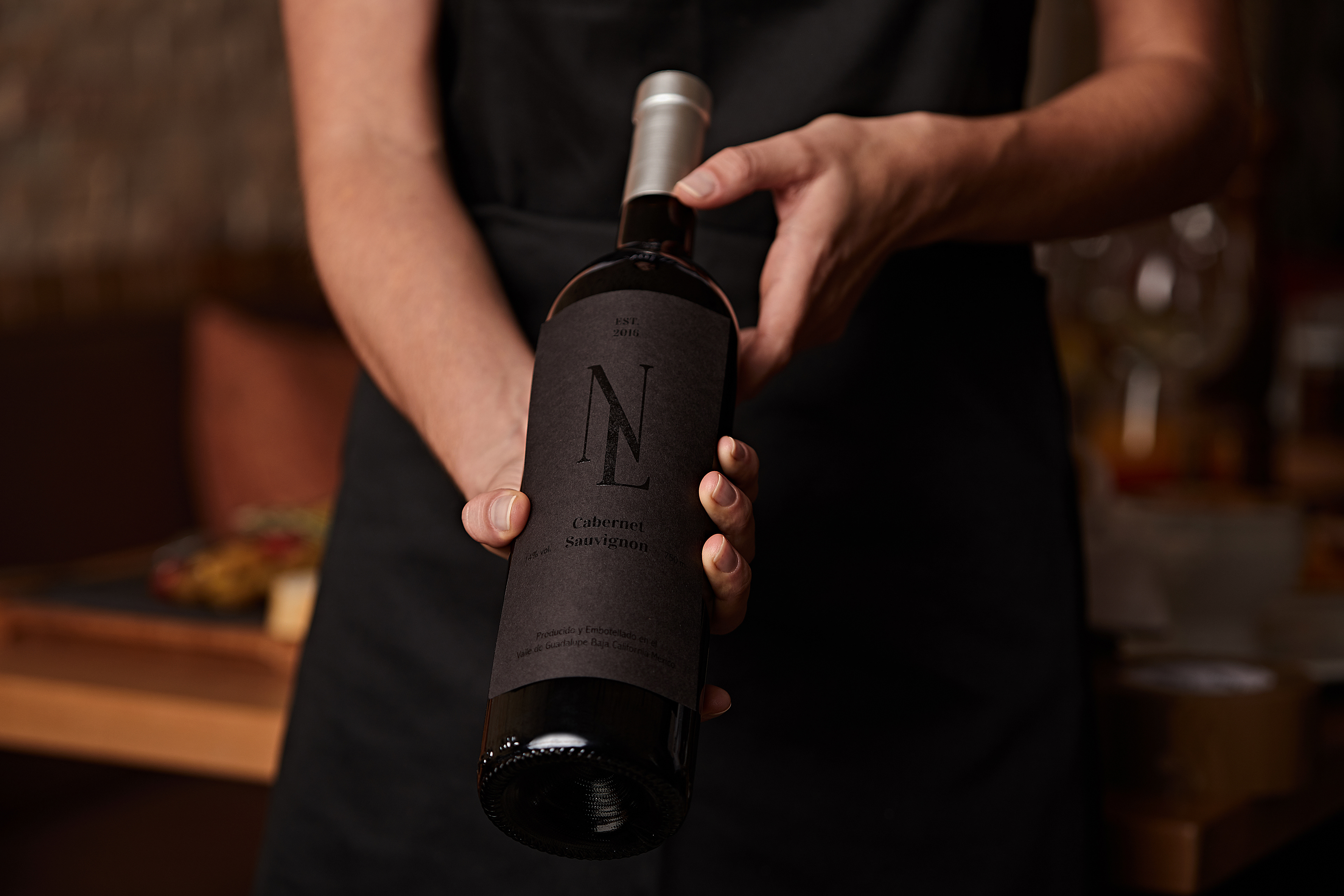
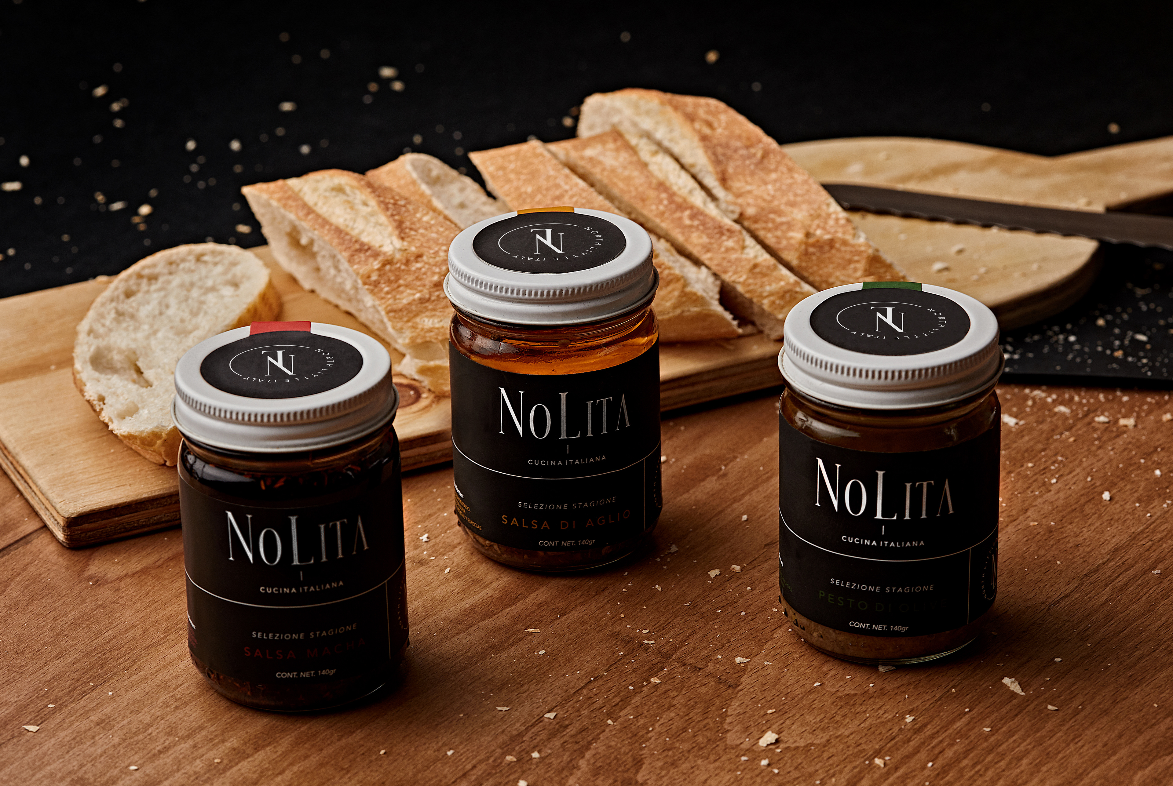
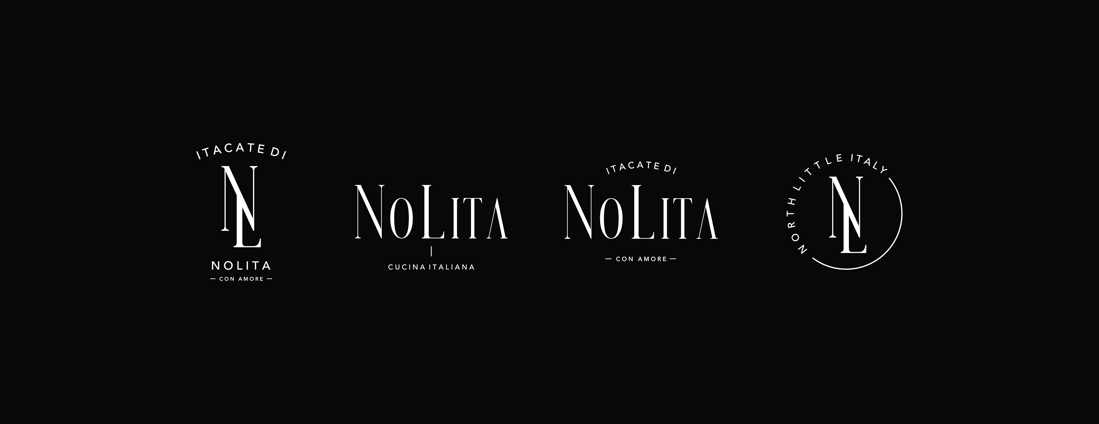
Our branding proposal for Nolita was inspired by classic monograms found in Tuscan Villas at the north of Italy. We convey an eclectic identity by combining classic symbols with modern applications. The name Nolita derives from North Little Italy, due to the neighborhoods that once were iconic Italian immigrant boroughs.
We developed four logos that add a more dinamic appoach towards the services the restaurant offers.
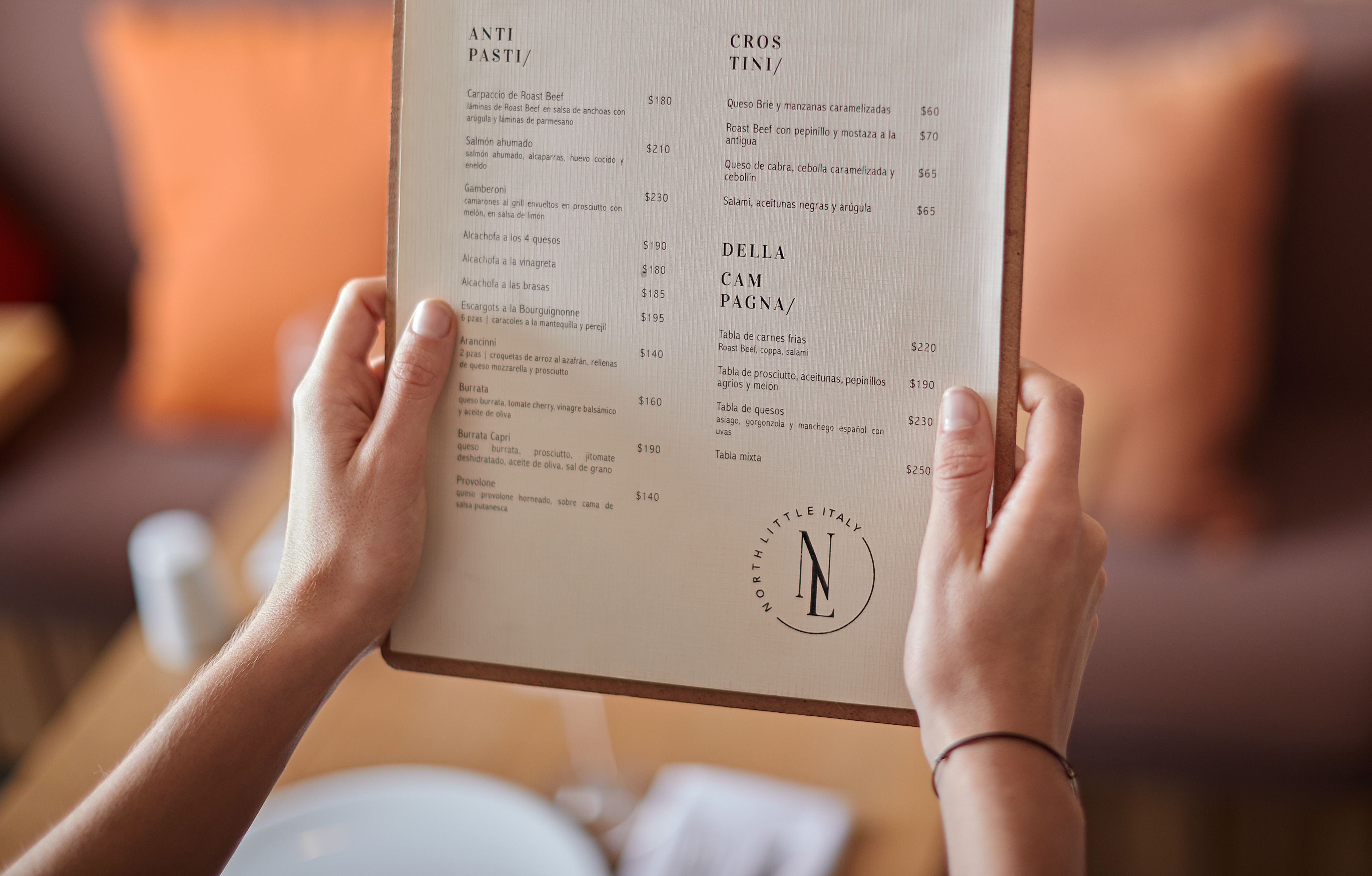
The color palette, which takes the main colors found in Italian cuisine as a base, are composed by red, yellow and green. The typographic selection also founds balance between classic and modern.
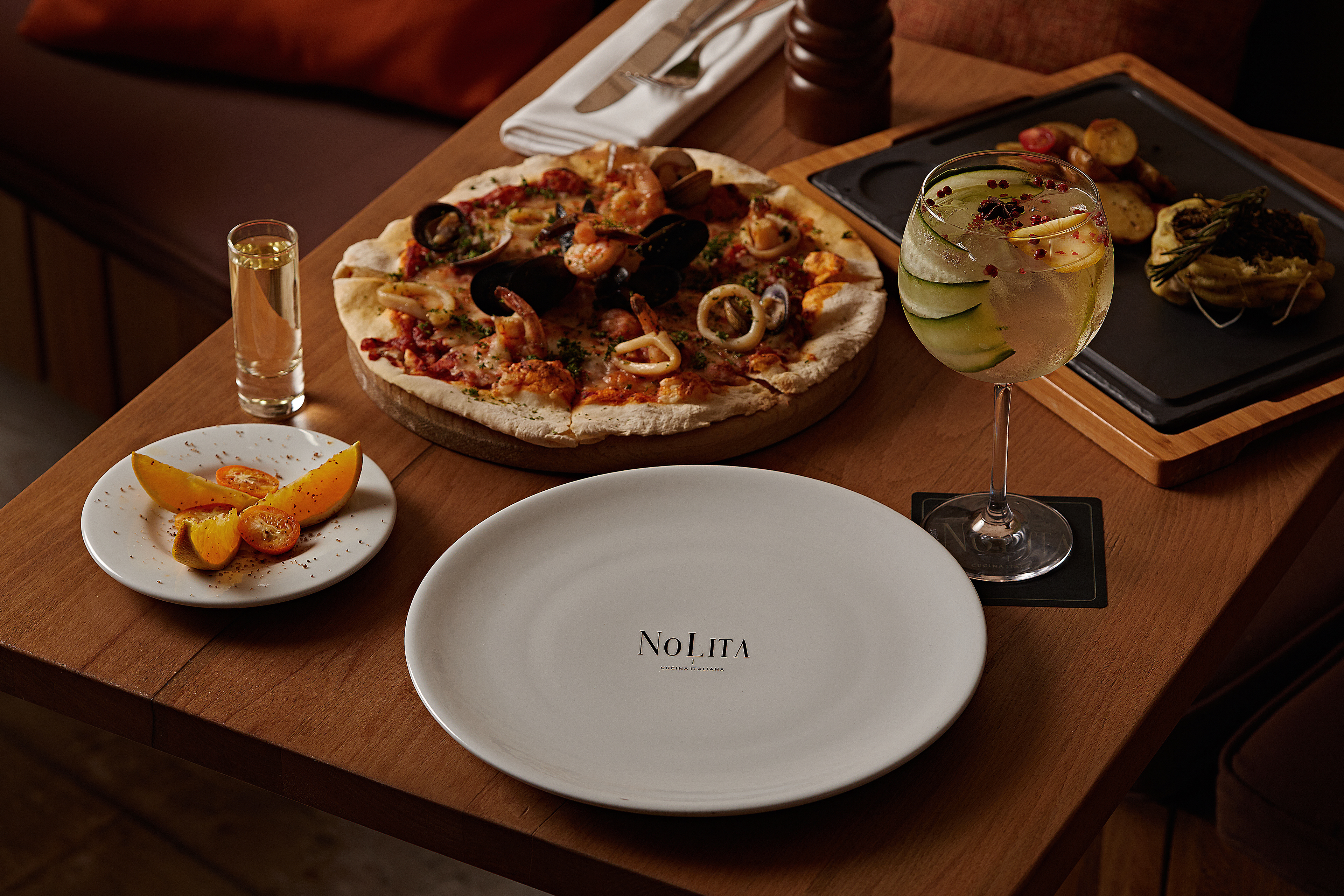
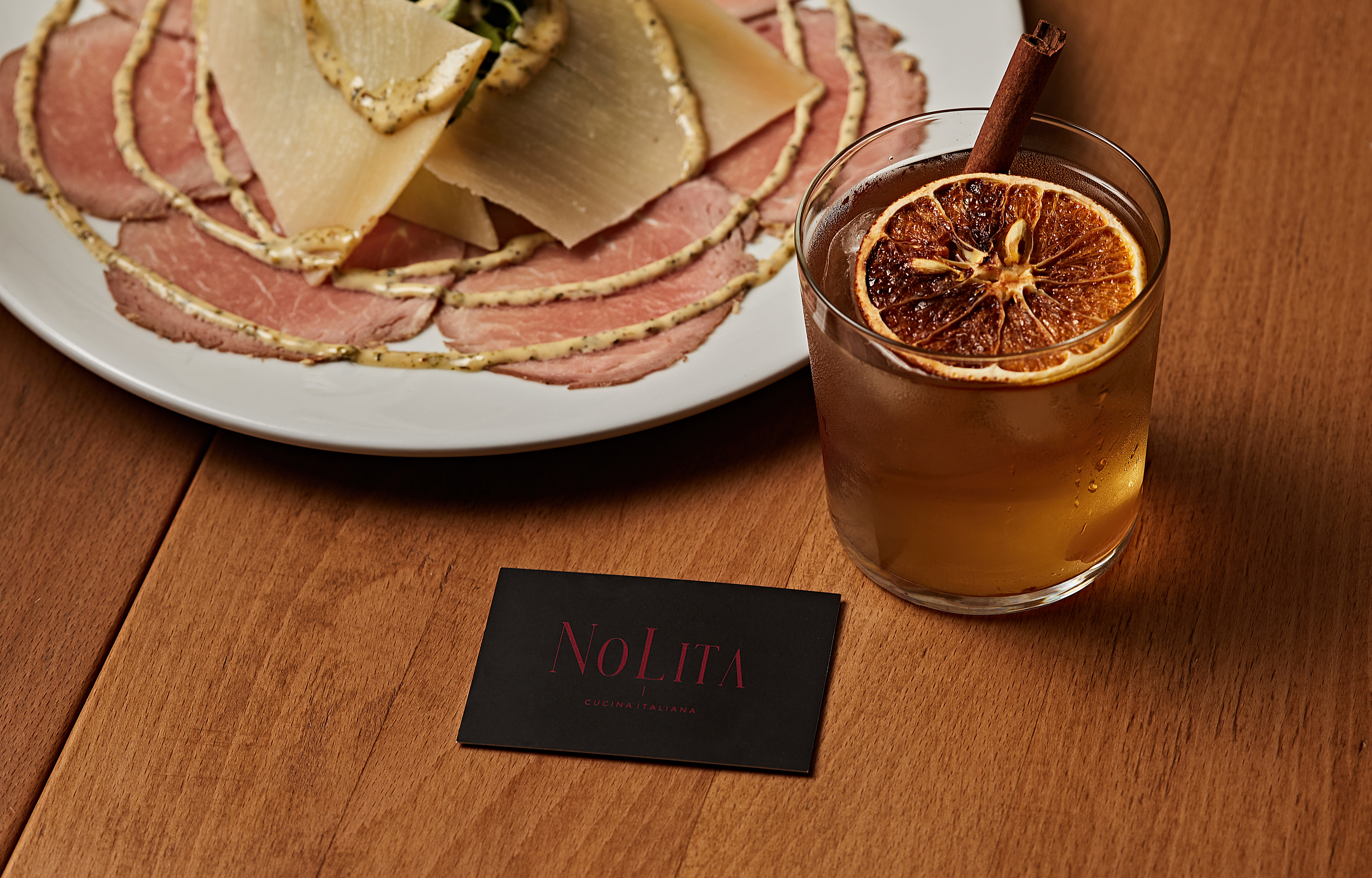
Nolita suggests an atmosphere suitable for enjoying and sharing traditional Italian food with family and friends.
Bon Appétit!